matplotlibを用いてラベルを追加したい
matplotlibはグラフ作成用のライブラリです。作成したグラフに対してラベルの追加方法について説明します。
matplotlibを用いたラベルの追加方法
X軸のラベルはxlabel、Y軸のラベルはylabelのメソッドにて追加することができます。
ソースコード(例)
|
1 2 3 |
import matplotlib.pyplot as plt plt.xlabel("X-label") plt.ylabel("Y-label") |
ソースコード(ラベル無し)
|
1 2 3 4 5 6 7 8 9 10 |
import pandas as pd import numpy as np import matplotlib.pyplot as plt %matplotlib inline x = np.arange(-10,11,1) y = x**2 plt.scatter(x,y,color="red") |
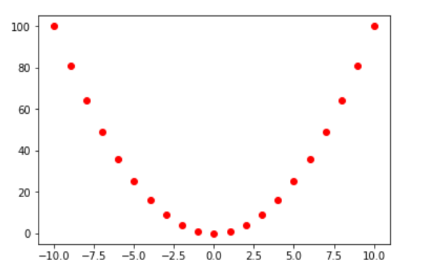
ラベルがありません。ラベルが無いとX軸とY軸が何を示しているかが分からなくなるのでラベルをつけるようにしましょう。
ソースコード(ラベル有り)
|
1 2 3 4 5 6 7 8 9 10 11 12 13 |
import pandas as pd import numpy as np import matplotlib.pyplot as plt %matplotlib inline x = np.arange(-10,11,1) y = x**2 plt.xlabel("X-label",fontsize=16) plt.ylabel("Y-label",fontsize=16) plt.scatter(x,y,color="red") |
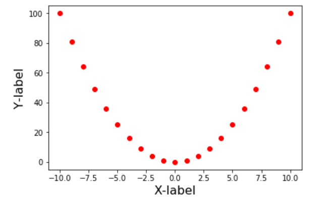
xlabel、ylabelを使用することでラベルの追加を行うことが出来ました。